website design
About
Cleveland Community College exists to serve the citizens of Cleveland County. It helps students achieve their educational and career goals by providing multiple educational pathways tailored to the life situation and particular student’s goals.
scope of work
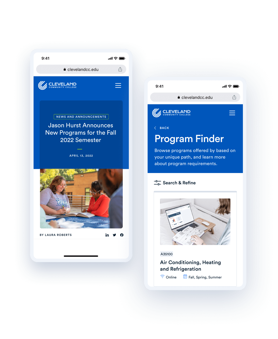
Launched a fully reimagined website with new content structure and navigation, an improved program and couse finder experience and new editor experience.
role
Lead UX Designer
Agency
Modern Tribe

The main challenge on this project was that users weren't able to find relevant information and preferred to call or visit the campus. This resulted in very low conversion rates – only 3% of users made it to the application form. Editors struggled with adding contant to the website and maintaining consistency across pages. The key objective was to increase conversion rates, while elevating the brand experience and increasing brand recognition.

We conducted in-person interviews and sent out a discovery survey, complemented with competitive analysis, analytics review, and a guided walkthrough of the current product. This allowed us to uncover the distinct needs of different audiences while using the website. We also defined key metrics - increasing application and enrollment rates, overall site performance, and minimize the number of unsuccessful searches.

The UX stage included journey mapping, user and task flows, creating the information architecture, navigation structure, as well as workshops on custom post types and taxonomies.


The key goal during design phase was to create a strong distinctive voice and visual presence for Cleveland Community College digital communications. The design embodies the uplifting and vibrant spirit of the college community, and supports its commitment to equity and diversity, while being accessible and inclusive.


We used adapted agile process to iteratively build the website using WordPress, integrate third-party applications and migrate content. Each sprint included QA, Design QA and eventually UAT. Feedback from these tests led to several rounds of design improvements. We adjusted filters, added one more taxonomy to program finder and created an event pattern. Each sprint also had a retro that resulted in actionable items and overall process improvement. After the build was complete, we created a style guide within the website and a set of training materials for the editors to ensure smooth onboarding to content creation.
Data from Similarweb.com
bounce rate
session length
monthly visitors
Some features identified as high-priority for the next phase of the project were ability to schedule a call with an advisor, event calendar integration and feedback integration. Lessons learned over the course of the project were mainly around distributing resources – more training time with content editors, less time spent in interviews, redistribution of time between UX and Visual design.
.png)

